Designing the IA for a hostel-based app for students

Recently, I did an assignment as part of an interview process, which involved designing the Information Architecture (IA) for an app. Here’s my process and results!
Duration : 4–5 hours
Step # 1 : Understanding the user
The assignment had the following problem statement:
Design the IA for a hostel-based app for students.
Now, I haven’t stayed in a student hostel myself, and had limited understanding based on experiences shared by friends, etc.
I interviewed 2 of my friends who have been college hostel residents, to understand the various problems they had faced. There was no hostel-based app implemented, and all the processes were manual.
I also performed desk-research to understand the problems faced by the hostel administration.
Based on this, I created a proto-persona of a student hostel-resident.

Step # 2 : Competitor analysis
Next, I explored existing products in similar space.
Since most of these products didn’t have a freely explorable version and had limited student-side screens showcased, this step was less insightful in understanding the exact IA used by competitors.

However, this helped in:
- Validating and finding alternatives to many parts of the solution, and
- identifying areas where existing solutions’ IA can be improved, such as lack of hierarchy, and having too many number of navigation items that could result in cognitive overload for the student user.
Step #3 : Prioritizing, grouping and labelling the features
Based on steps 1 and 2, I listed the various features the app would have.
It is important to list the features at the right level of detail / fidelity and ensuring that the naming of features is appropriate.
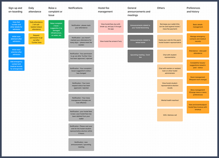
Step #4 : Uncovering the users’ mental model through Card-sorting exercise
I implemented an open card-sorting exercise with a user.
This involved me sharing a FigJam file with the list of features that has been completely randomized, and the user taking the time to go through them, and organizing them into different categories, and finally giving an appropriate name to those categories.
This gave more insight into the natural categories for navigation, in accordance with the users’ mental model.

Step #5 : Designing the IA
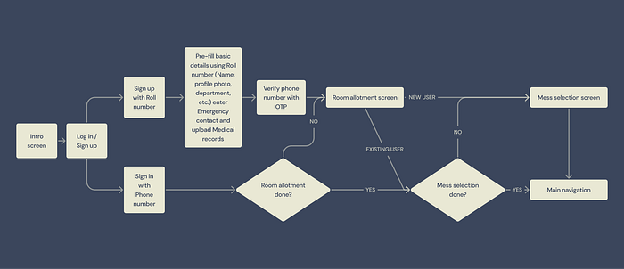
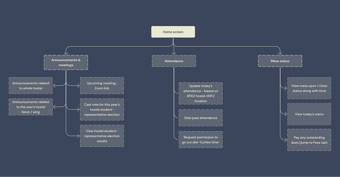
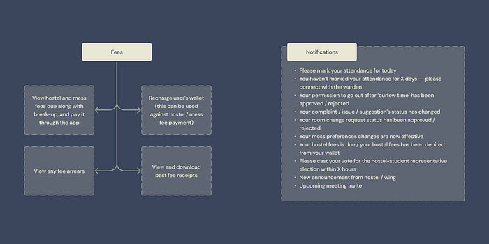
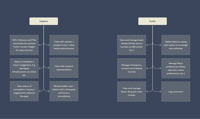
Based on the prioritized features and results of the card-sorting exercise, I created the IA from the sign-up flow and onwards.
Key considerations:
- IA should be in line with the users’ mental model and must have a clear hierarchy
- The user’s cognitive load to should be at a minimum, i.e. no more than ~7 navigation items per level

Step #6 : Testing the IA — Tree testing
Although tree-testing is a quantitative method that requires around 50 users to be the ideal sample-size, I performed tree testing with 2 users (different from the card-sorting exercise), to identify any gaps in the IA.
I gave the users various tasks and asked which navigation menu would they click first (, second,…) to accomplish them.
Learnings:
- Majority of the tasks were successfully navigated by the test users.
- Users expected to be able to recharge their wallet from the ‘fees’ screen, so the decision to include a shortcut there was validated.
- Users expected to find the option to ‘ask permission to go out after Curfew time’ to be present under ‘Helpline’, which was fair — the IA needs to be revised with respect to this.

